Project Overview
The American Board of Physician Specialties (ABPS) is a professional organization that offers board certification to physicians across various specialties. They sought to redesign their website to enhance user experience, modernize the visual style, and improve accessibility.
For this project, I focused on designing a clean, intuitive, and accessible website that showcased the professionalism of ABPS. My design work aimed to create a cohesive visual identity while improving the overall usability.
Duration
3 months
Software
Adobe Photoshop, Webflow, WordPress
Categories
Responsibilities
I led the design efforts for the ABPS website, focusing on visual direction, user experience, and accessibility. Key responsibilities included:
- Custom Website Design: Crafted a fresh and professional design that aligned with ABPS’s brand and provided an intuitive user experience.
- Custom Iconography: Designed unique icons to enhance the site’s visual appeal and improve usability across the site.
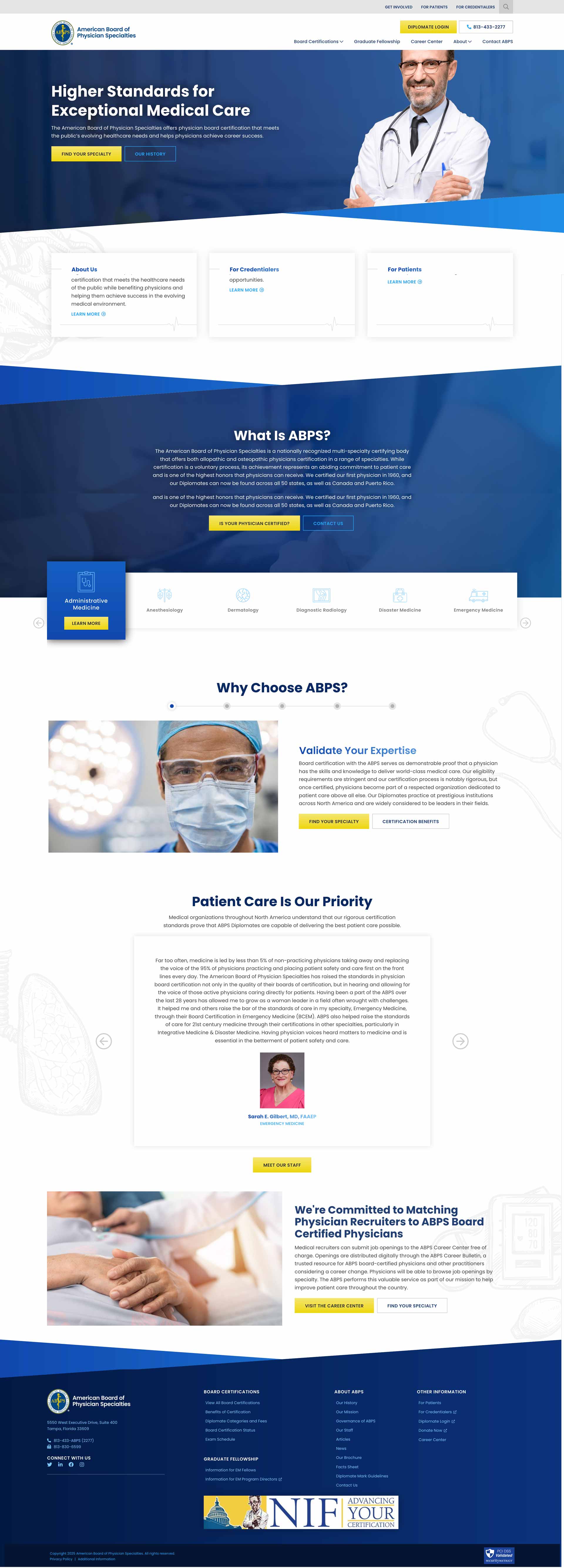
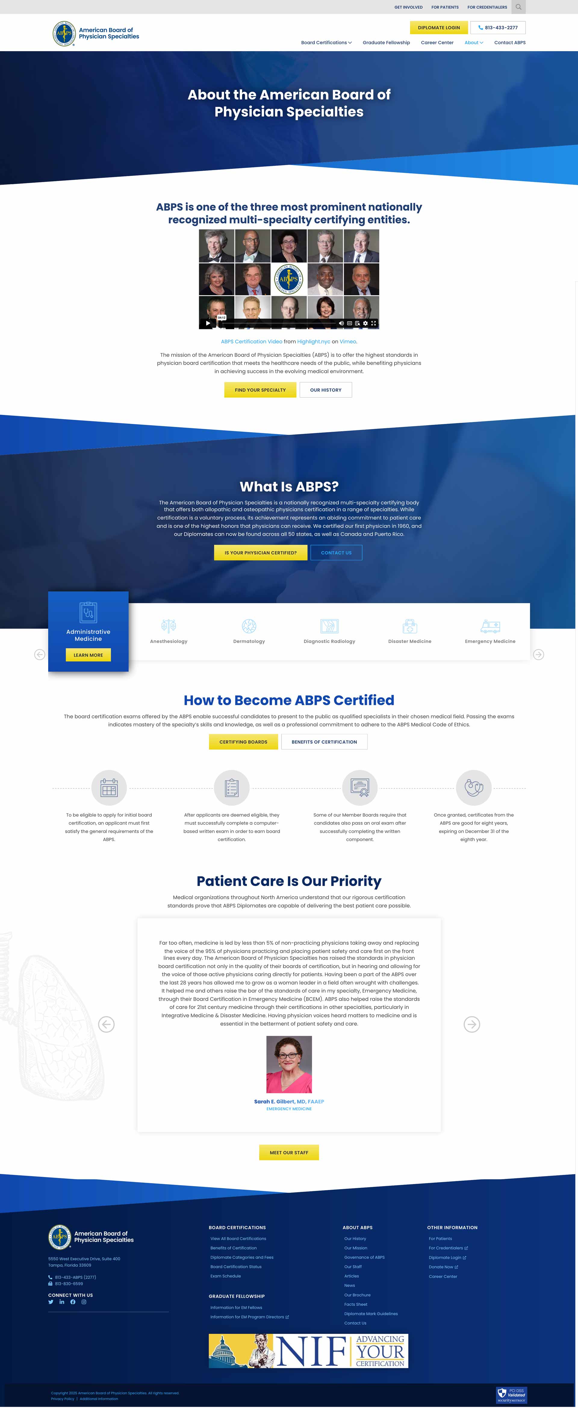
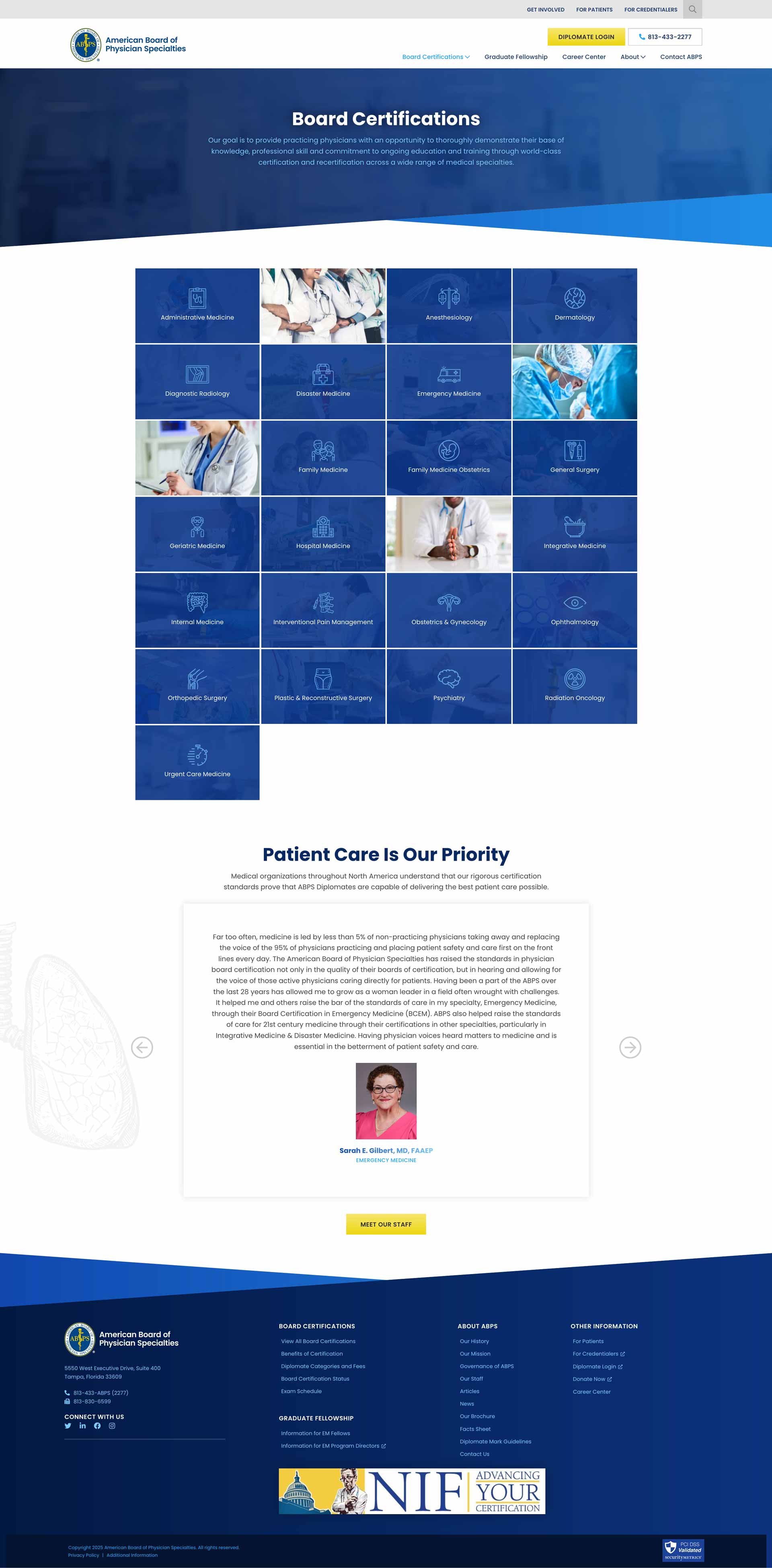
- Page Layouts: Developed custom layouts for the Home, About, Board Certifications, and Contact pages, ensuring content was well-organized and easy to navigate.
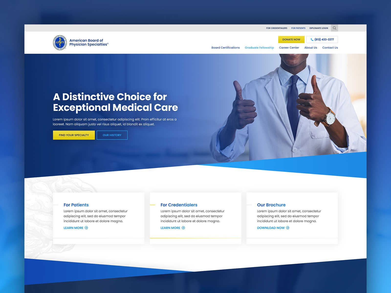
- Style Tiles Design: Created style tiles to establish a clear design direction, including typography, color palettes, and other design elements.
- Wireframes & Prototypes: Developed wireframes and high-fidelity prototypes in Webflow to demonstrate key user flows and interactions.
- Design System: Created a custom design system that ensured visual consistency and flexibility for future updates.
Key Features
The new website design was crafted to provide an enhanced user experience and improve the organization’s online presence. Notable features included:
- Accessible Design: Focused on meeting accessibility standards to ensure the website was usable by all visitors, regardless of their abilities.
- Refined Branding: A modern, professional look that reinforced ABPS’s reputation as a trusted certifying body for physicians.
- User-Centric Layouts: Developed clear, easy-to-navigate pages that guided users through information on certifications, the organization, and contact details.
- Custom Iconography: Designed icons that visually represented ABPS’s services and streamlined content discovery.
- Style Tiles: Provided an early visual concept to guide the client through the design direction, aligning it with ABPS’s brand values.
- Responsive Design: Ensured the website was fully optimized for both desktop and mobile devices.
Results
The redesign resulted in a more visually appealing and accessible website. Key outcomes included:
- Improved User Engagement: Simplified navigation and an intuitive layout contributed to a better user experience, encouraging deeper engagement with the content.
- Stronger Brand Identity: The refined design enhanced ABPS’s credibility and professionalism, reinforcing trust with visitors.
- Increased Accessibility: The accessible design improvements made the website more inclusive for users with varying needs.
- Enhanced Usability: The clear visual hierarchy and user-friendly navigation improved the ease with which users could find information.